![[background image] image of a workspace (for a mobile gaming)](https://cdn.prod.website-files.com/684805891c92594b6263618d/68932bff26c8ce6720cbe5d8_Presently%20%20MacBook%20(1).png)
We’d just landed our first ever FMCG customer, and with no prior patterns or edge cases, we were asked to ship a fully functional dashboard UI. It was a clean slate, a great chance to get the foundation right. I worked alongside another designer to define, design, and deliver a simple, enterprise-ready UI that’s now helping us close this high-stakes partnership.


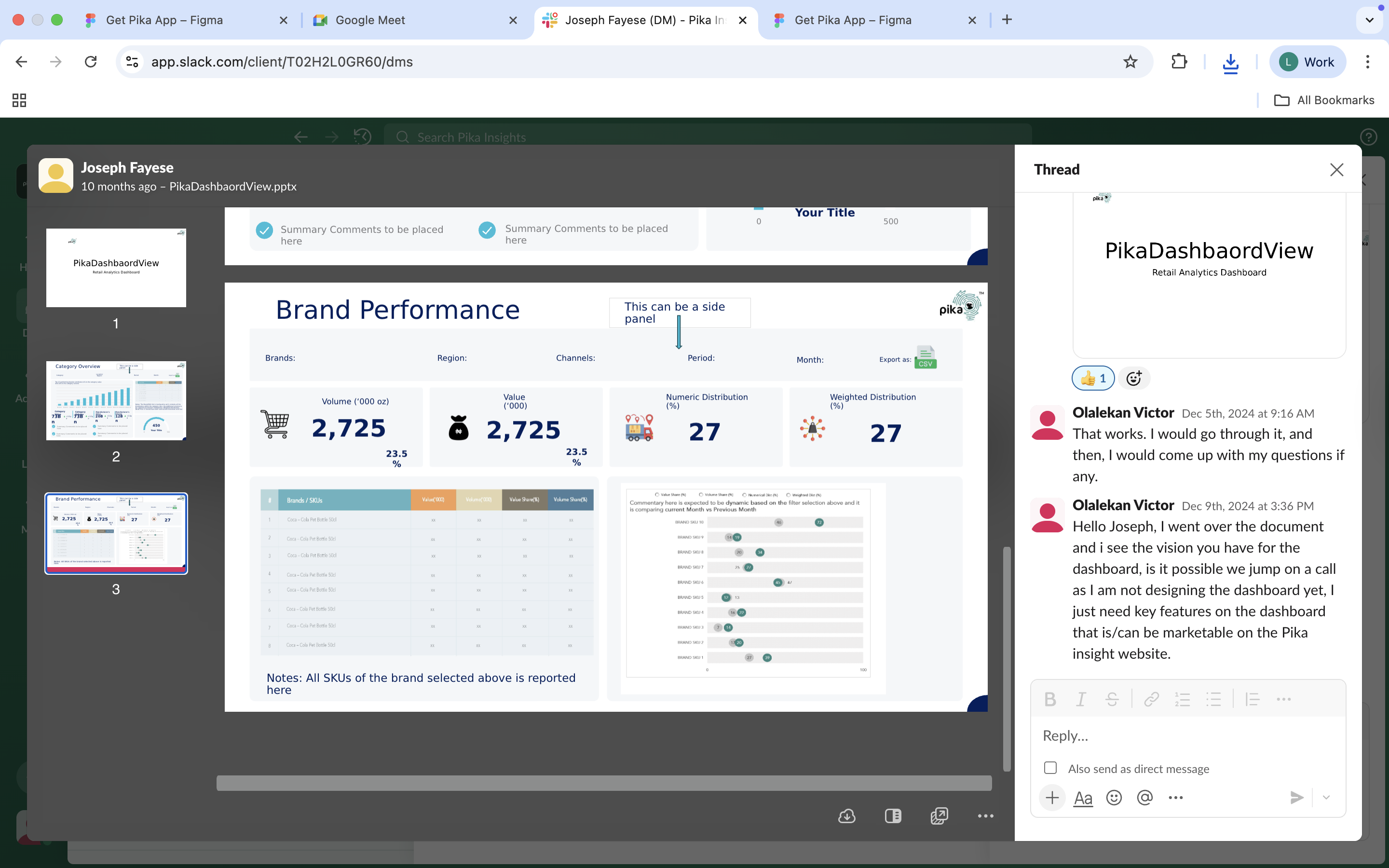
This project was a milestone: our team had never worked directly with FMCG clients before. As we approached onboarding our first enterprise customer, we were tasked with creating a foundational dashboard UI, one that could not only support their immediate data needs but also demonstrate that our product was ready for scale.I wasn’t the lead on this project, but I worked closely with the other designer to co-design the dashboard and supporting flows (e.g., settings and password recovery). We prioritized clarity, responsiveness, and scalability, ensuring the design could grow with customer demands.The dashboard you see here was part of the proof, a working UI delivered swiftly, with strong fundamentals that helped leadership see our product’s potential in the FMCG space.
![[digital project] image of a graphic design on a screen (for a web design agency)](https://cdn.prod.website-files.com/684805891c92594b6263618d/68d11a4e169cbdf3aa4d4e20_Screenshot%202025-09-22%20at%2010.42.29.png)
Overview
🧩 The Challenge
We were entering a new vertical (FMCG) with no prior enterprise-facing interface. Our goal wasn’t to solve edge cases or deep insights just yet, it was to prove product readiness with a clean, data-friendly dashboard UI that could handle the basics well.
We needed a layout that would:
Be flexible enough for future feature expansion.
Make it easy for non-technical users to explore and interpret data.
Reinforce trust and professionalism in the eyes of a prospective client.
Help our leadership close the deal confidently.
🎯 The Goal
To design and implement an FMCG-ready dashboard UI that could support our first customer’s needs while acting as a visual proof-of-concept for enterprise adoption.
This meant delivering:
A modular, scalable layout.
Smooth flows for settings, account access, and recovery.
Clear organization of KPIs, user access, and controls.
An interface clean enough to be demoed, and solid enough to scale
✅ The Solution
We designed a streamlined, enterprise-facing dashboard with key supporting flows:
A data overview section with room for account summaries, user tracking, and metrics.
A flexible settings panel for team access, profile changes, and account management.
A lightweight password recovery flow to keep friction low for enterprise users.
This solution is now in front of our first FMCG customer and has already helped leadership build trust and gain momentum toward signing. It’s our first entry into the space, and a great UI foundation for more advanced features down the line.
![[digital project] image of creative illustrations on a laptop screen](https://cdn.prod.website-files.com/684805891c92594b6263618d/6894a7577f3c623079d0a900_Gemini_Generated_Image_of60fuof60fuof60.jpeg)
Our approach followed a clear progression:
![[digital project] image of creative illustrations on a laptop screen](https://cdn.prod.website-files.com/684805891c92594b6263618d/6894b721bdd4b6229bf99ce2_Gemini_Generated_Image_f0ck0of0ck0of0ck.jpeg)
What Determined the IA and Structure
Selected work, simply displayed
![[digital project] image of a graphic design on a screen (for a web design agency)](https://cdn.prod.website-files.com/684805891c92594b6263618d/689078718e1baa348a0a023b_Screenshot%202025-08-04%20at%2010.07.39.png)
To bring order to the evolving Pika experience, I created a design system tailored for informal retailers. It was built to be intuitive for first-time smartphone users, with clear contrast, accessible font sizes, and repeatable patterns across screens. The system allowed us to scale from agent tools to inventory and insights without redesigning from scratch every time.
A look at the solution for the Pika Dashboard MVP
.png)
.png)
.png)
![[digital project] image of creative illustrations on a laptop screen](https://cdn.prod.website-files.com/684805891c92594b6263618d/6899d334afad51c48b4021fd_Dashboard%20Overview%20(3).png)
![[digital project] digital interface on a tablet](https://cdn.prod.website-files.com/image-generation-assets/f5a36406-9c73-420d-817d-5591acfe7a33.avif)
.png)