![[background image] image of a workspace (for a mobile gaming)](https://cdn.prod.website-files.com/684805891c92594b6263618d/68d078139fa43cdaa9f23029_Feedback%20image%20(1).png)
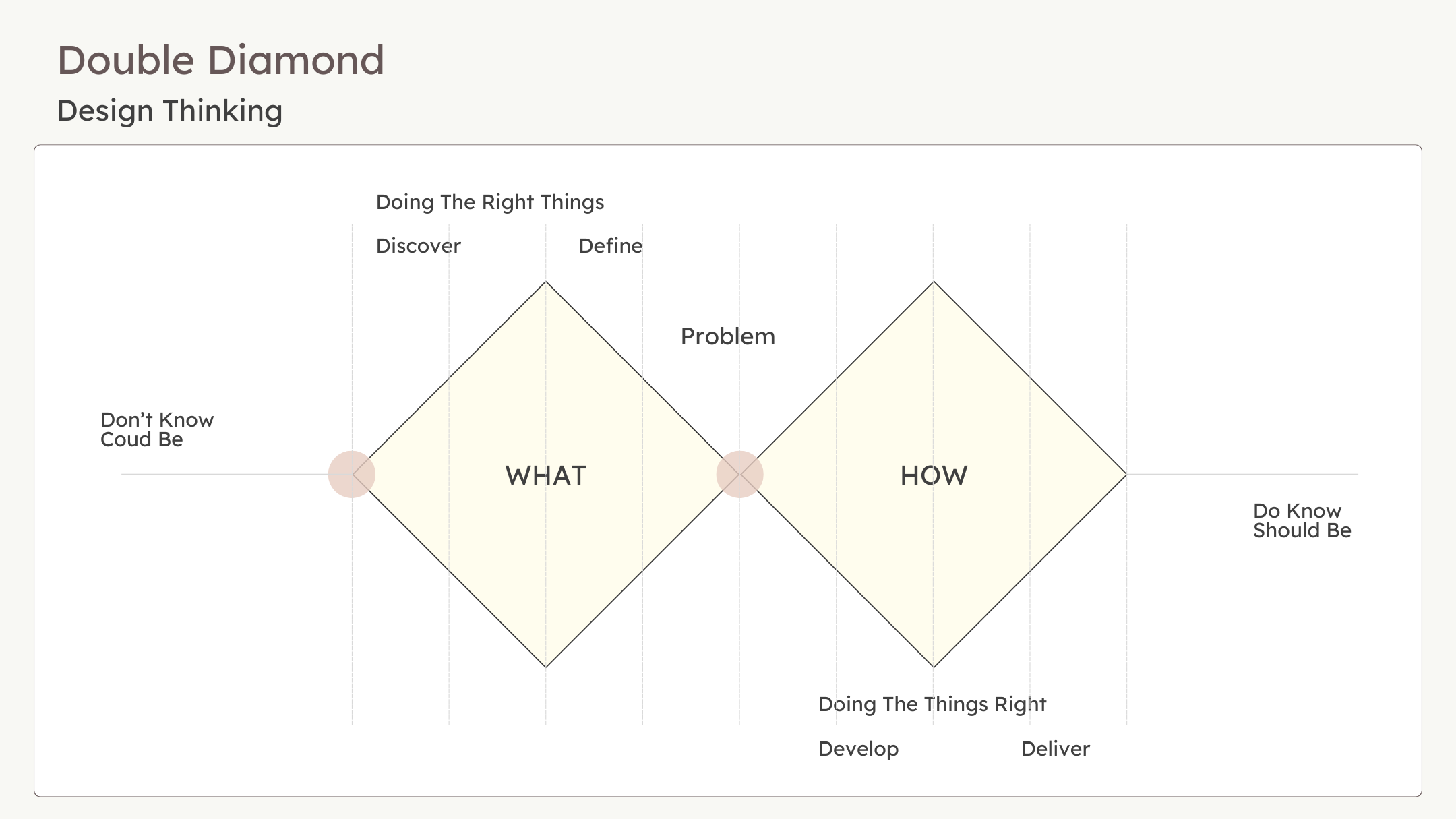
Designing a clear, actionable, and scalable dashboard that helps SME leaders identify, understand, and mitigate human risk—the leading cause of cybersecurity incidents in 2025.
In 2025, the landscape of cybersecurity shifted dramatically. For years, organizations had invested billions into strengthening their technology stacks — but breaches continued to rise.
The problem was no longer just weak technology; it was people.
According to Mimecast’s State of Human Risk (SOHR) 2025 Report, human error now accounts for the majority of security incidents.
From misaddressed emails to credential misuse, the human factor emerged as the single largest vulnerability.
![[digital project] image of a graphic design on a screen (for a web design agency)](https://cdn.prod.website-files.com/684805891c92594b6263618d/68cc0afa0476ea03f55fd7d1_Screenshot%202025-09-18%20at%2014.36.10.png)

The SOHR 2025 report revealed several insights that framed the challenge:
95% of all data breaches stem from human error.
79% of leaders agree collaboration tools introduce new threats.
81% are concerned about Generative AI misuse, yet over half lack a clear strategy.
My Validation & Reasoning
While reviewing industry reports, I also conducted secondary research to validate these findings. I found two consistent gaps in existing security dashboards:
Too Complex — Enterprise SOC Dashboards
Enterprise-grade dashboards like Microsoft Defender and Proofpoint provide extreme depth. But they assume the user has a trained security team to interpret the data. For SME leaders, these tools overwhelm rather than empower.
Too Shallow — Lightweight SaaS Tools
On the other end, some SaaS dashboards oversimplify risks. They flag issues but fail to guide leaders on corrective actions, leaving them uncertain about how to respond.
![[digital project] image of a graphic design on a screen (for a web design agency)](https://cdn.prod.website-files.com/684805891c92594b6263618d/68cd147e837f1b8e9b7b4b2c_Screenshot%202025-09-15%20at%2018.23.35.png)

How might we design a dashboard that helps SME leaders identify and mitigate human risk, without needing SOC expertise?
Measure compliance, policy adherence, and employee behavior in a way leaders could trust.
Translate complex security risks into simple, actionable insights.
Balance clarity with depth, so the dashboard is approachable but not superficial.
To answer this, the solution needed to:
To better understand the visual and functional space, I explored competitor dashboards across three tiers:
![[digital project] image of a graphic design on a screen (for a web design agency)](https://cdn.prod.website-files.com/684805891c92594b6263618d/68cd61cb3cea8e947616eb18_65327195cede3c4a7cde9579_Hero.webp)
Used these references as a moodboard for visual language, but intentionally designed a middle ground → clarity with actionable depth.
Lightweight tools oversimplify risks, leaving leaders unsure of next steps.
Found that enterprise dashboards are data-heavy and assume SOC expertise.
Looked at leading dashboards (enterprise-grade, mid-market tools, and lightweight SaaS).
Moving from research based on my resourses i do have access to right now to design, I followed a structured yet iterative process.
I began by mapping out the types of information SME leaders need at first glance versus what they might want to drill deeper into. The goal was to keep the overview simple but provide clear pathways to deeper insights.
![[digital project] image of a graphic design on a screen (for a web design agency)](https://cdn.prod.website-files.com/684805891c92594b6263618d/68ce9e9f81fd6b44c87f19d2_IMG_1852.jpeg)
![[digital project] image of a graphic design on a screen (for a web design agency)](https://cdn.prod.website-files.com/684805891c92594b6263618d/68ced33d349de637114d4006_New%20Wireframe%201.png)
I sketched multiple directions: one mimicking enterprise-style layouts, another closer to lightweight SaaS. Through feedback loops, I discarded extremes and focused on a hybrid approach: an overview dashboard with quick actions and drill-down capabilities.
With each iteration, I tested with peers (non-security users) and A.I. to ensure the dashboard felt approachable, while still resonating with the seriousness of security.
![[digital project] image of past client project on a digital tablet screen (for a graphic design studio)](https://cdn.prod.website-files.com/684805891c92594b6263618d/68cf0a13a6e940587e2428b2_MacBook%20Pro%2016_%20-%201%20(6).png)
When I wrapped up my first version of the dashboard, I knew it couldn’t stop there. Cybersecurity is too complex to assume that a single pass would “get it right.” Just like in real-world product work, the real value emerges when designs are stress-tested against fresh eyes and perspectives.
![[digital project] image of interface explaining ai curriculum](https://cdn.prod.website-files.com/684805891c92594b6263618d/68d27ebfb8d4226d9751de93_V2.png)
.png)